
Inspirational Quote
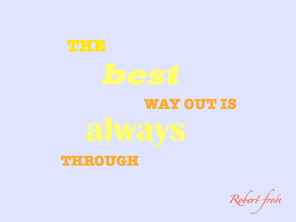
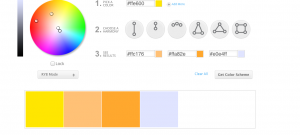
I choose this quote because I though the words were valuable words to live by. The quote was soft in my opinion and that is why I choose pastel colors. I did not want to use any sharp colors because I did not think that was the vibe of the quote. The bold letters are there so the colors could really pop over the light blue. Overall I thought I captured that character of the quote.
the fonts and colors you used work very well with the quote you chose
I like you quote. I like the yellows and oranges. I think the blue goes well with the colors.